Employee Net Promoter Score (eNPS): Formula, Scale, and What a Good Score Looks Like
One question, one subtraction, one number between −100 and +100. The employee Net Promoter Score (eNPS) has become the default shorthand for "how do our people feel about working here?" - reported to boards, tracked quarter over quarter, and argued about in HR forums ever since companies borrowed it from the customer world. This guide covers the whole thing: the question, the formula, the scale, what a good score actually looks like against published benchmarks, the survey questions worth asking, how to run the survey without fooling yourself, and the limits that eNPS's biggest fans tend to skip.
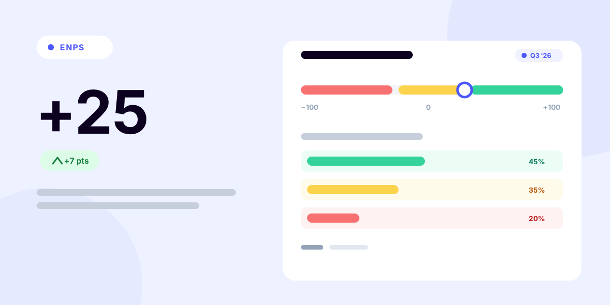
One question, netted: the share of enthusiasts minus the share of critics.
What is employee Net Promoter Score?
eNPS adapts the Net Promoter framework - originally built to measure customer loyalty - to the workplace. The original metric has a specific pedigree: Bain & Company's Fred Reichheld introduced it in his December 2003 Harvard Business Review article "The One Number You Need to Grow," developed with Bain and the research firm Satmetrix as a one-question proxy for customer loyalty. (Net Promoter® and NPS® are registered trademarks of Bain & Company, NICE Systems, and Fred Reichheld.) HR teams later turned the same question inward on their own workforce - the "e" simply marks the employee edition.
It rests on a single survey question:
"On a scale of 0–10, how likely are you to recommend [company] as a place to work?"
Responses sort into three groups:
- Promoters (9–10): genuinely enthusiastic. These are the people who refer friends, defend the company in hard moments, and signal a healthy environment.
- Passives (7–8): content but uncommitted. Not unhappy enough to complain; not invested enough to promote.
- Detractors (0–6): actively unenthusiastic. Note how wide this band is - a "6" that would feel like a decent review on most scales counts as a detractor here, by design.
The score nets the two ends against each other and ignores the middle - which makes it deliberately sensitive to strong feeling in either direction.
The eNPS formula
eNPS = % promoters − % detractors
Both percentages are calculated against all responses, passives included. The result is expressed as a whole number, not a percentage.
A worked example
Out of 100 responses: 45 promoters, 35 passives, 20 detractors.
- Promoters: 45 ÷ 100 = 45%
- Detractors: 20 ÷ 100 = 20%
- eNPS = 45 − 20 = +25
The theoretical range runs from −100 (every respondent a detractor) to +100 (every respondent a promoter); in practice, both extremes essentially never occur. If you'd rather not push the numbers by hand, the calculator below - the same free eNPS calculator from our tools pages - does the arithmetic and gives you a plain-English read of the result.
100 responses total. Passives count toward the total but don't move the score.
Your eNPS
+25
% promoters (45%) − % detractors (20%)
How to read it
Good
Clearly more promoters than detractors. Keep doing what's working.
Bands are common rules of thumb, not universal benchmarks. Your own trend over time and the gaps between teams are the more useful reads.
Two properties of the formula are worth internalizing:
- Passives are invisible to the score but not to reality. A company with 20% promoters, 70% passives, and 10% detractors scores +10 - the same as one with 55% promoters, 0% passives, and 45% detractors. Same number, radically different organizations. Always look at the distribution, not just the net.
- Small teams make noisy scores. With 20 respondents, each person is 5% of the sample - so one person shifting from passive to promoter moves the score by 5 points, and a detractor becoming a promoter swings it by 10. Read team-level eNPS in ranges and trends, never as precise values.
The eNPS score range: −100 to +100
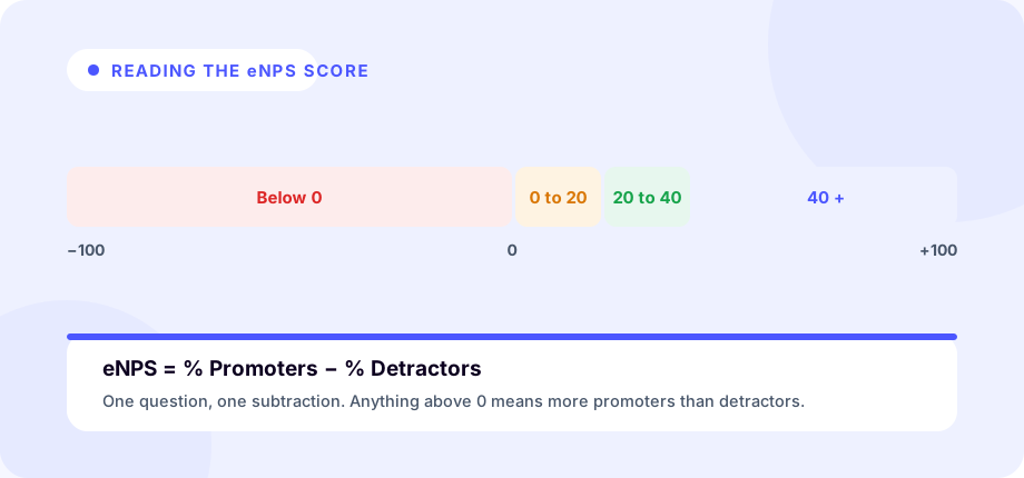
The eNPS score range is fixed: every possible result lands somewhere between −100 and +100, expressed as a whole number rather than a percentage. Three points on that scale anchor everything else:
- −100 - the floor. Every respondent is a detractor (0–6) and there are no promoters, so promoters minus detractors is 0 − 100.
- 0 - the break-even line. Promoters and detractors are exactly balanced; the enthusiasts and the critics cancel out.
- +100 - the ceiling. Every respondent is a promoter (9–10) and there are no detractors, giving 100 − 0.
Both ends are theoretical - real programs never come close to either. Actual eNPS values live in a much narrower band that clusters around zero, which is exactly why the interpretation bands below - not the raw endpoints - are what you compare a score against.
What is a good eNPS score?
The uncomfortable truth first: there is no universal benchmark. Scores vary by industry, region, company size, survey timing, and even question wording. Vendors publish benchmark tables, and they disagree with each other - which tells you most of what you need to know about benchmark-chasing.
That said, widely used rules of thumb give you a starting vocabulary:
| Score | Common read |
|---|---|
| Below 0 | Needs attention - more critics than enthusiasts; investigate the drivers |
| 0 to +20 | Reasonable - typical territory for many companies |
| +21 to +40 | Good - clearly more promoters than detractors |
| Above +40 | Excellent - and comparatively rare |
What published eNPS benchmarks actually say
If you want real published numbers rather than folklore, here is what two of the most-cited sources report - and how visibly they differ. SurveyMonkey's eNPS benchmarks guide, citing Hive HR's Q3 2024 data, puts the cross-industry benchmark at +27, with a wide industry spread: technology at +28, health and manufacturing at +15, retail at −5, and government at −15. The same dataset shows a company-size gap, from +30 at companies under 250 employees down to +9 at organizations above 5,000. Perceptyx, drawing on a benchmark database it describes as covering more than 20 million employees, reports its global eNPS benchmark has "stabilized in the low-to-mid 20s" - without publishing per-industry point values at all. And Hive's own Q2 2025 quarterly update shows hospitality around +37 while government and retail sit around −20 to −13. (All figures as published at the linked sources, accessed July 2026.)
Read those side by side and the lesson writes itself: different panels, different quarters, and different survey methods produce different "averages." Published benchmarks are useful for one thing - confirming that the rules-of-thumb bands above are roughly where reality lives - not for grading your company against a decimal.
Treat the bands and benchmarks as conversation starters, not grades. The reads that actually inform decisions are:
- Your trend. A move from +5 to +18 over three quarters is a meaningful signal. A one-off +18 is a data point.
- Your internal gaps. A company at +15 with one function at −25 doesn't have an eNPS problem; it has a specific management problem the average is hiding.
- Your verbatims. The open-ended follow-up ("What's the main reason for your score?") is where every action item lives. The number tells you whether to dig; the comments tell you where.
eNPS benchmarks
There is no official eNPS benchmark, and the published figures above make that plain: the same metric averages out differently across sources, quarters, and panels. The dependable way to use a benchmark, then, is as a set of general interpretation bands - a shared vocabulary for what a score tends to signal - while holding onto the caveat that the "typical" number varies by industry and source.
Read as general guidance rather than a grading scale, the widely used bands are:
| eNPS band | General interpretation (illustrative - varies by industry and source) |
|---|---|
| Below 0 | Concerning - detractors outnumber promoters; treat it as a prompt to investigate |
| 0 to +20 | Good / typical - the range most organizations fall into |
| +21 to +40 | Strong - clearly more promoters than detractors |
| +40 and above | Excellent - and comparatively uncommon |
These bands describe direction and rough altitude, not a target to hit. A score is only "good" or "bad" relative to your own industry, region, company size, and prior quarters - which is why your trend and your internal team-to-team gaps tell you more than any published average ever will.
What does a negative eNPS score mean (and how to recover)?
A negative eNPS score means detractors outnumber promoters: more employees answered 0–6 than answered 9–10. Because passives (7–8) don't count toward the score, going negative doesn't require a majority of unhappy people - only more critics than enthusiasts. Any value below 0 is negative, and −100 is the theoretical floor where every respondent is a detractor.
What a negative score is and isn't:
- It is a clear signal that, on balance, more people would warn a friend away from working here than would recommend it - worth taking seriously rather than explaining away.
- It isn't automatically a crisis or a judgment on any one person. A single negative reading can reflect survey timing (a layoff, a reorg, a frozen bonus), a low or skewed response rate, or one struggling function dragging the average down. Confirm the pattern before you act on it.
How to recover, roughly in order:
- Read the verbatims first. The open-ended "What's the main reason for your score?" is where the why lives. A negative number tells you to dig; the comments tell you where.
- Segment the score. Break it out by team, manager, tenure, and location, within the limits of anonymity. A company-wide negative often turns out to be one or two groups in real distress rather than a uniform problem - a far more actionable diagnosis.
- Fix the drivers, not the number. The score moves as a by-product of the substance behind it - manager quality, workload, growth, recognition, and fair pay. Our employee engagement strategy guide covers where that work actually lands.
- Close the loop visibly. Share the result honestly, name the themes you heard, and commit to specific changes. Nothing rebuilds trust - or lifts the next score - like employees seeing that candid answers led to action.
- Re-measure on your normal cadence. Recovery shows up as a trend across quarters, not a single rebound, so resist the urge to re-survey immediately in search of a friendlier number.
eNPS vs. NPS
The mechanics are identical - same question structure, same 0–10 scale, same subtraction. The differences are about audience:
- Employees are tougher graders. People hold the place they work to a higher standard than a product they buy, so eNPS runs lower than customer NPS in the same organization. Don't panic when your eNPS trails your NPS; that's the normal pattern.
- The sample is smaller and interdependent. A thousand customers answer independently; forty employees share managers, reorgs, and a Slack channel. Workplace events move eNPS in correlated jumps.
- The stakes of anonymity differ. Customers don't fear consequences for a 3; employees might. Guaranteeing (and visibly honoring) anonymity is a precondition for honest eNPS data.
eNPS survey questions
The core question is standardized for a reason - the trend line only means something if the wording never moves. The canonical form:
"On a scale of 0–10, how likely are you to recommend [company] as a place to work?"
Accepted variants add a recipient ("…to a friend or colleague?") or name the act ("How likely are you to recommend working at [company]?"). Any of them is fine; what matters is picking one and freezing it. Rewording the question mid-trendline quietly resets your history.
The score tells you whether something changed; the follow-up questions tell you what. A well-built eNPS survey adds two or three of these - always optional, always open-ended enough to let people surprise you:
- "What is the main reason for your score?" - the universal follow-up. This single open text box is where nearly every action item in an eNPS program comes from.
- "What would need to change for you to score us a 9 or 10?" - aimed at passives and detractors. It converts dissatisfaction into a concrete, prioritized fix list instead of a vague complaint.
- "What nearly made you give a lower score?" - aimed at promoters. It surfaces the risks and frustrations that enthusiasm is currently masking, before they compound.
- "What's one thing we should keep doing?" - identifies the strengths worth protecting, so a cost cut or reorg doesn't accidentally delete the reason people stay.
- "What's one thing we should change or stop doing?" - gives explicit permission to name friction; phrased as "one thing," it forces prioritization rather than a grab-bag.
- "Do you see yourself working here in two years? What would make that more likely?" - probes retention intent directly. Recommending a workplace and planning to stay in it are related but distinct; the gap between them is informative.
- "How well does your day-to-day work use your strengths and move your career forward?" - a growth-driver probe; stalled development is one of the most common forces quietly dragging scores (and retention) down.
- "Does your manager give you the support you need to do your best work?" - a manager-driver probe; when one team's score diverges from the company's, this question usually explains it.
Two cautions. Keep the survey short - the core question plus two or three follow-ups; a twelve-question "eNPS survey" is an engagement survey with worse response rates. And rotate the driver probes (6–8) between cycles if you like, but never touch the core question or the main-reason follow-up, because those two power the trend.
Running an eNPS survey well
The measurement is simple; the discipline around it is what separates useful programs from theater.
- Keep the question standard. Rewording the question or shifting the scale breaks your trend line - the single most valuable thing eNPS produces.
- Pick a cadence and hold it. Quarterly is the most common: frequent enough to catch changes, infrequent enough to avoid fatigue. Measuring right after layoffs or bonus payouts tells you about the event, not the baseline.
- Always pair it with one open question. "What's the main reason for your score?" converts a metric into an agenda.
- Segment before reacting - by team, manager, tenure, and location, within the limits of anonymity (never slice groups so small that individuals become identifiable; it destroys trust and your data quality with it).
- Close the loop in public. Share the score, name the themes, say what will change. Nothing raises participation - and scores - like evidence that answering mattered. What actually moves the number is the substance of employee engagement strategy: manager quality, growth, recognition, and fair pay.
The honest limits of eNPS
eNPS earns its place on a scorecard, but it earns criticism too, and the criticism is fair:
- It's aggregate. Anonymous and periodic by design, eNPS describes groups. It cannot tell you that this specific senior engineer - the one whose departure would hurt most - has mentally left.
- It's lagging. By the time sentiment sours enough to move a quarterly survey, the underlying erosion has usually been building for months.
- It's gameable and fragile. Survey timing, response rates, and who bothers to answer all bend the number. A falling response rate is itself a warning sign that often precedes a falling score.
This is why eNPS belongs in a scorecard rather than being the scorecard - sitting alongside turnover and regretted-attrition rates, tenure patterns, and genuine leading indicators, as laid out in our guide to employee retention metrics & KPIs.
The retention-critical gap is the individual one. Group sentiment can look fine while your most important person quietly interviews - which is why teams pair eNPS with individual-level early-warning signals. TeamPredict fills exactly that gap: it flags resignation risk for specific employees from public LinkedIn signals, giving managers lead time to act - no survey required, and no waiting for next quarter's score to confirm what you could have known this week. For the broader playbook, see how to predict employee turnover.
The bottom line
eNPS is a genuinely useful thermometer: cheap to run, easy to explain, and honest about direction when you protect the trend line and read the segments. Just remember what a thermometer can't do - it won't tell you which patient is about to walk out of the hospital. Measure the temperature quarterly; watch the individuals continuously.
Frequently asked questions
- What does eNPS stand for?
- eNPS stands for employee Net Promoter Score. It adapts the customer NPS framework to the workplace by asking employees one question - how likely they are to recommend the company as a place to work, on a 0–10 scale - and netting the enthusiastic answers against the unhappy ones.
- How is eNPS calculated?
- eNPS = % of promoters − % of detractors. Promoters answered 9 or 10, detractors answered 0 to 6, and passives (7–8) count in the total but don't move the score. The result is a whole number between −100 and +100. For example, 45 promoters, 35 passives, and 20 detractors out of 100 responses gives an eNPS of +25.
- What is a good eNPS score?
- There's no universal benchmark - scores vary by industry, region, company size, and how the survey is run, and vendors' published benchmark tables disagree with each other. Common rules of thumb: below 0 needs attention, 0 to +20 is reasonable, +21 to +40 is good, and above +40 is excellent. For orientation, published cross-industry benchmarks cluster in the twenties - Hive HR's Q3 2024 benchmark was +27, and Perceptyx puts its global benchmark in the low-to-mid 20s. Your own trend over time, and the gaps between teams, are far more informative than an absolute target.
- What does a negative eNPS score mean?
- A negative eNPS means detractors (people who answered 0–6) outnumber promoters (9–10); because passives (7–8) don't count toward the score, you can go negative without most employees being unhappy - just with more critics than enthusiasts. Any score below 0 is negative, with −100 as the theoretical floor. Treat it as a signal to investigate rather than a verdict: read the open-ended comments, segment by team and manager to find where the dissatisfaction concentrates, fix the underlying drivers, and re-measure on your normal cadence to confirm the trend.
- What is the difference between eNPS and NPS?
- NPS asks customers how likely they are to recommend a product or company; eNPS asks employees how likely they are to recommend it as a place to work. The scale and formula are identical. The audiences differ in one important way: employees answer more critically than customers, and there are far fewer of them - so eNPS scores tend to run lower and swing more, and small teams should read score changes cautiously.
- Is eNPS a good predictor of employee turnover?
- Only weakly, and only at the group level. Because eNPS surveys are anonymous and periodic, they describe team-level sentiment, not individual intent - a team can post a healthy score while its most critical member is actively interviewing. Treat eNPS as one directional input, paired with individual-level leading indicators of flight risk, rather than as an early-warning system.
About TeamPredict
TeamPredict Team
We build TeamPredict - retention early-warning software that flags resignation risk from public LinkedIn signals. We write about the patterns that precede a resignation and how people-first teams act on them early. Learn more about TeamPredict
Find out who's showing exit signals.
Score one person's flight risk in a couple of minutes with the free assessment - then let TeamPredict watch the rest daily.
Run the free flight-risk assessmentFree, no signup required.